Acreage report
- Role
- UX design and front-end implementation
- Status
- Shipped; replacement planned
- Outcome
- Simplified complex reporting while revealing unsupported commodity exceptions
 Agricorp needed to replace a 15-year-old acreage-reporting system as part of a broader modernization of its underwriting platform. The challenge was to make reporting straightforward on any device while supporting planting arrangements that could range from simple ownership to multiple share-crop agreements.
My manager and I developed the design brief. I collected business requirements and created the wireframes, while our forms designer produced high-fidelity designs for senior-management approval. I implemented the visual design in CSS and worked closely with developers throughout delivery.
Challenging the inherited model
Replacing the technology also meant reconsidering long-held organizational assumptions about what the product needed to be. The legacy experience reflected years of programme and system history, but did not account for changing customer expectations or mobile use.
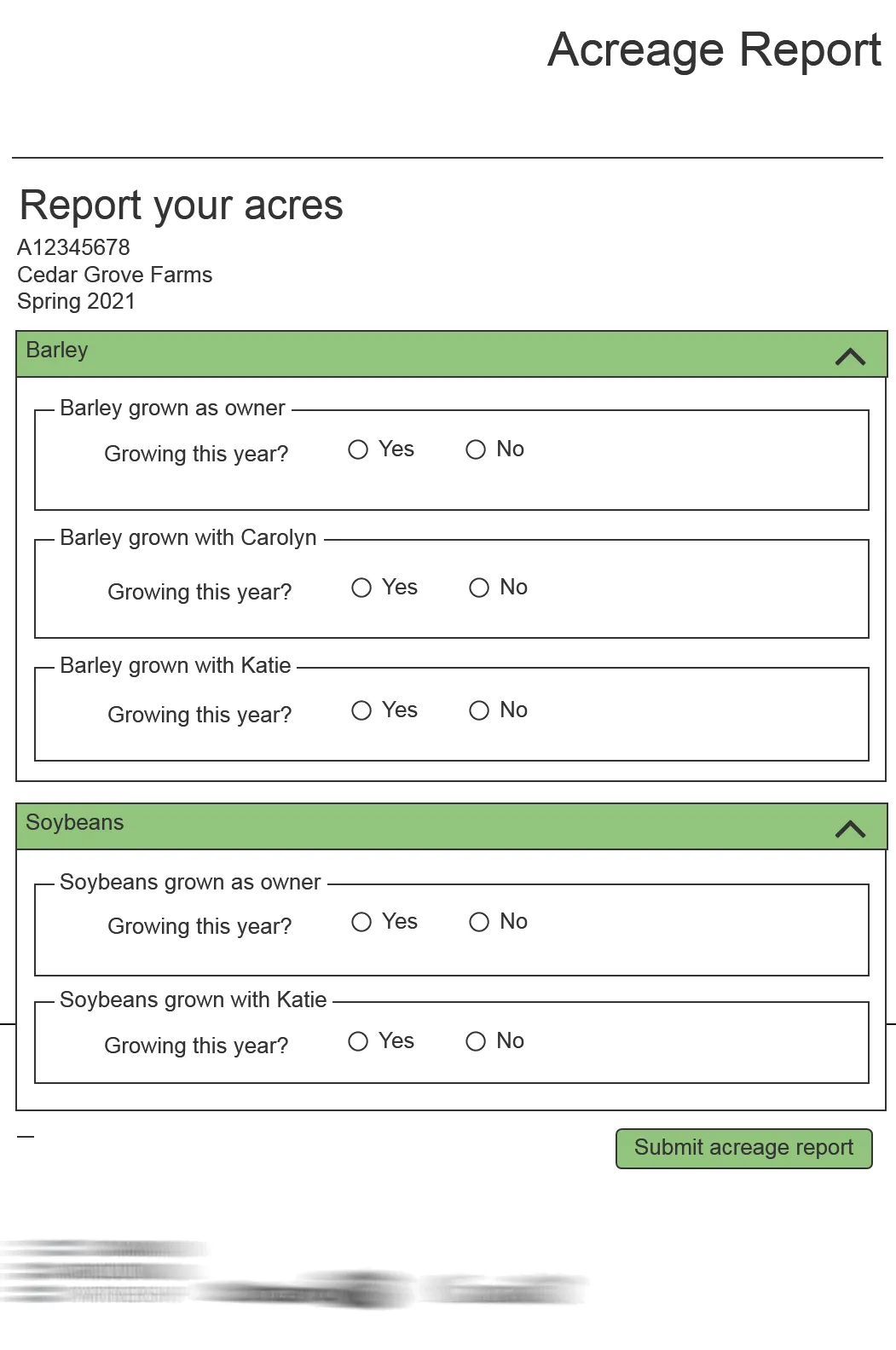
We reorganized the reporting process around the customer’s task rather than the structure of the underlying system. Progressive disclosure allowed customers to focus on the information currently requiring attention while keeping more complex planting arrangements available when needed.
Keeping errors visible
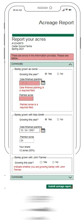
Collapsible sections made a long and complex report easier to manage, but introduced another problem: collapsing a completed section could also hide fields containing errors.
I designed a validation model that elevated a summary message to the top of the page and displayed an error indicator on any collapsed section requiring attention. Customers could see that the report remained incomplete and identify where to return without keeping every section open.
This pattern allowed us to simplify the page without concealing the system’s status or separating errors from the fields customers needed to correct.
Looking beyond the redesigned screen
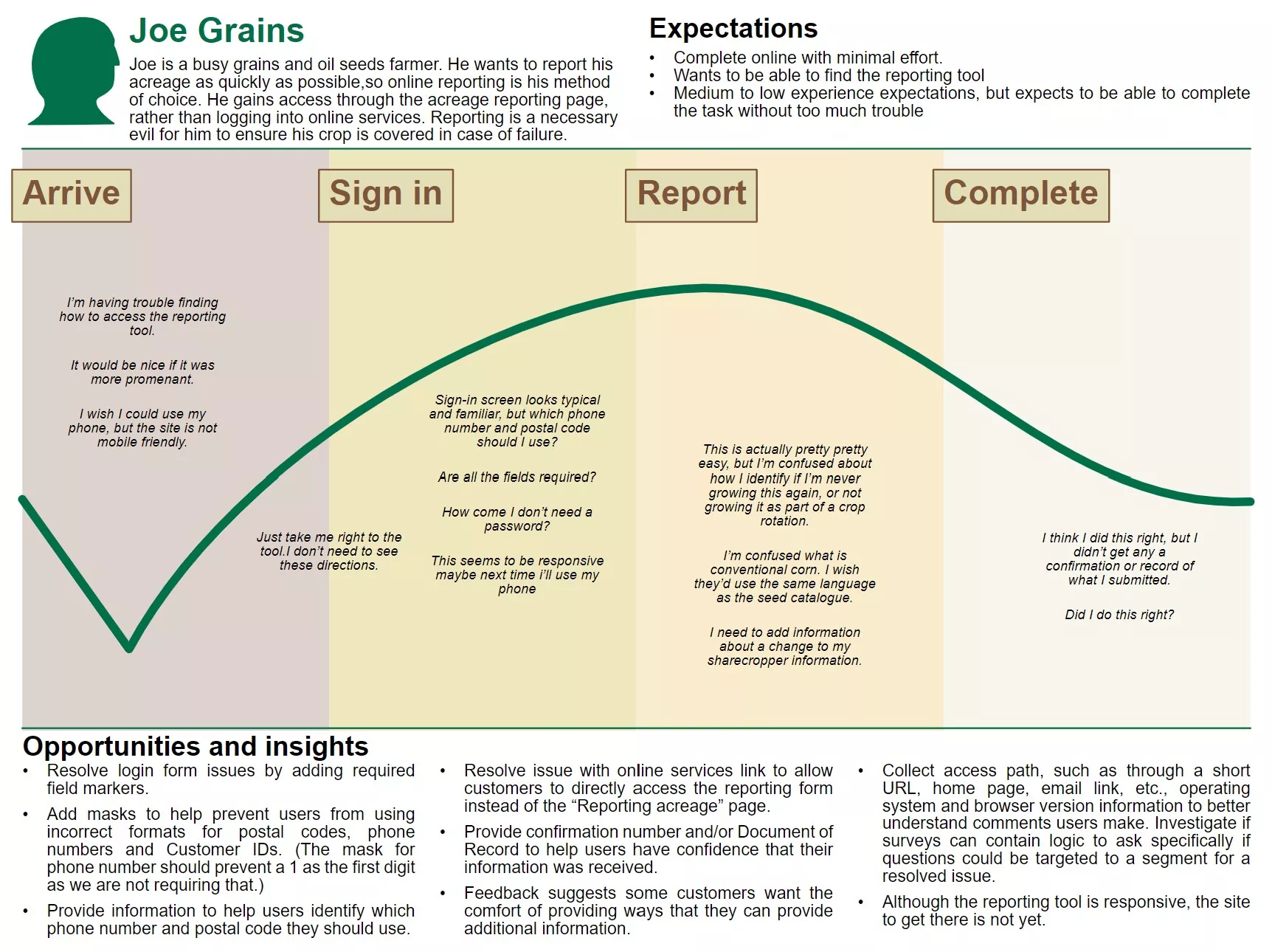
The report itself became responsive, but customers still entered it through a portal that was difficult to use on mobile devices. I used customer feedback to map that surrounding journey and demonstrate how the entry point weakened an otherwise mobile-friendly experience. That issue is expected to be addressed through Agricorp’s planned website replacement.
Close collaboration with a developer who wanted to understand the reasoning behind the design helped us work through technical constraints while preserving the intended experience. The simplification was noticeable to customers; after completing the report, one responded, “Is that it?”
Learning from unsupported exceptions
Subsequent feedback revealed an important gap in the original requirements. Some commodities were subject to special reporting conditions that customers could not provide through the redesigned service. Those customers still needed to call Agricorp to complete their reporting.
The redesign simplified the workflows it supported, but it did not yet create a complete digital journey for every customer. The finding changed how I understand the next iteration: simplifying the primary path is not enough unless discovery also identifies the exceptions that determine who cannot use it.
The planned replacement will build on what worked while accounting for commodity-specific conditions and the surrounding customer journey. It will also adopt Agricorp’s current design system, making the experience easier to maintain and more consistent with newer products.